Currency
Selecting the best paper to achieve the best print
Categories:
Printing tips
25/Jun/2020
-->
When it comes to printing your image, it’s essential that you consider the ink and paper that will bring out the best of the image you’ve spent time and effort crafting. We’ve selected a range of black and white, and colour images from photographers David Smith, Janet Burdon, and Karl Pennington, and printed them on four of our papers – Platinum Baryta 300, Legacy Gloss 325, Smooth Cotton 300 Signature, and Natural Soft Textured Bright White 315 – to demonstrate the nuances between them and what can be achieved.
Selecting your paper – what to consider
When selecting between paper for your print, the first element to consider is whether you want to go for a coated or matt finish. If you’re choosing a coated paper, the D-MAX and contrast is going to be higher and will give a more punchy, vivid image. So, if you have a nice, sharp black and white image, or something with a lot of colour that you want to make pop, then a glossy or semi-glossy paper is going to be the paper of choice for you.
If you’re looking for something slightly subtler with a smoother finish, then a matt paper will be the route you want to go down. Once you’ve made that decision, you can begin looking at the variety of paper in between and what they have to offer. Texture is a key factor to think about – if you have an image with lots of detail, then a textured paper will help accentuate that detail. However, we have one rule of thumb which is to never use a heavily-textured paper on a portrait image as it will make the skin appear pitted. In this case, use the smoothest paper you can.
What’s the difference between matt black and photo black ink?
This is a question that we get asked a lot, but it is in fact very simple. For every matt paper, you should use matt black ink. For anything that isn’t matt paper, you should use photo black ink – regardless of whether it’s a colour or black and white print. The reason for this is due to the fact that matt black ink has a higher density of particulars. If you were to use matt black ink on a gloss or semi-gloss paper, there would be too much particulate, and the ink wouldn’t be able to get into the base of the paper. On the other hand, if you used photo black ink on a matt paper, you’d end up with a washed-out, black look to the print, which may be suitable if this is what you’re looking to achieve.
David Smith
Considering the base colour of the paper is imperative as it will have an influence on how the final image looks. Take a really cool/neutral black and white image such as this from David Smith – a paper with as white a base as possible will keep the blacks deep and allow the highlights to shine, giving a great contrast between the two.

Smooth Cotton
With the Smooth Cotton, a slightly warmer base doesn’t work as well to differentiate between the two – the blacks aren’t as deep and it ends up creating a slightly softer image.

NST Bright White
For this print therefore, we would recommend NST Bright White. If we wanted glossy, we would go for Platinum Baryta as it has a slightly cooler base which helps differentiate between the black and the white.

Platinum Baryta
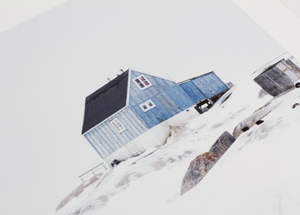
Janet Burdon
At first glance, it could be easy to say that there’s not a huge amount of colour or detail in this image, however, there is actually a range of white and white-blues popping out of the rocks. In this instance, we would exclude warm papers – the Legacy Gloss and Smooth Cotton – as we want to retain the coolness of the image.


Legacy Gloss / Smooth Cotton
Although hard to call, as the image rendition is very similar, we would go for the NST Bright White as when we hold it we prefer the feel, which as mentioned, is ultimately a matter of personal choice.

Natural Soft Textured Bright White
John Starkey
This minimalistic, smooth-looking seascape isn’t a harsh black and white image like David Smith’s, therefore we want a bit of warmth coming through to help the soft transitions. We’re going to count out the Platinum Baryta and the NST Bright White and compare the Legacy Gloss and Smooth Cotton. Although the Legacy Gloss is good for warmth, we like the ultra-smooth finish of the Smooth Cotton which helps with what John is trying to achieve with the very soft gradations between tones.


Legacy Gloss Smooth Cotton
Karl Pennington
It’s big, it’s bright, and there’s a lot of detail. For this print, we’re going to exclude the Platinum Baryta and Smooth Cotton as we want to pick up as much detail and brightness as possible and consider the NST Bright White and Legacy Gloss.

Natural Soft Textured Bright White
We’re going to be a bit controversial here. For us, the colour rendition, contrast, punchy feel to the paper, and detail from the texture in the Legacy Gloss is an absolute winner.

Legacy Gloss
Are you interested in learning more about achieving the best print for your photography? Check out the rest of our blog, or get in touch with the Fotospeed team.
If you would like to stay on top of all the latest information from Fotospeed don't forget to sign up to our Newsletter.