Currency
Submitting a Panel for the Associateship of the Welsh Photographic Federation by Mike Martin
Categories:
Fotospeed Photographers
03/Oct/2022
Mike Martin discusses his approach to creating a successful panel of people images
If you’re like Mike and have a number of images that you feel really proud of, why not challenge yourself to create a panel and see if you’ve got what it takes to be successful. Mike discusses the thought processes below sharing a few tips for anyone considering a similar path.
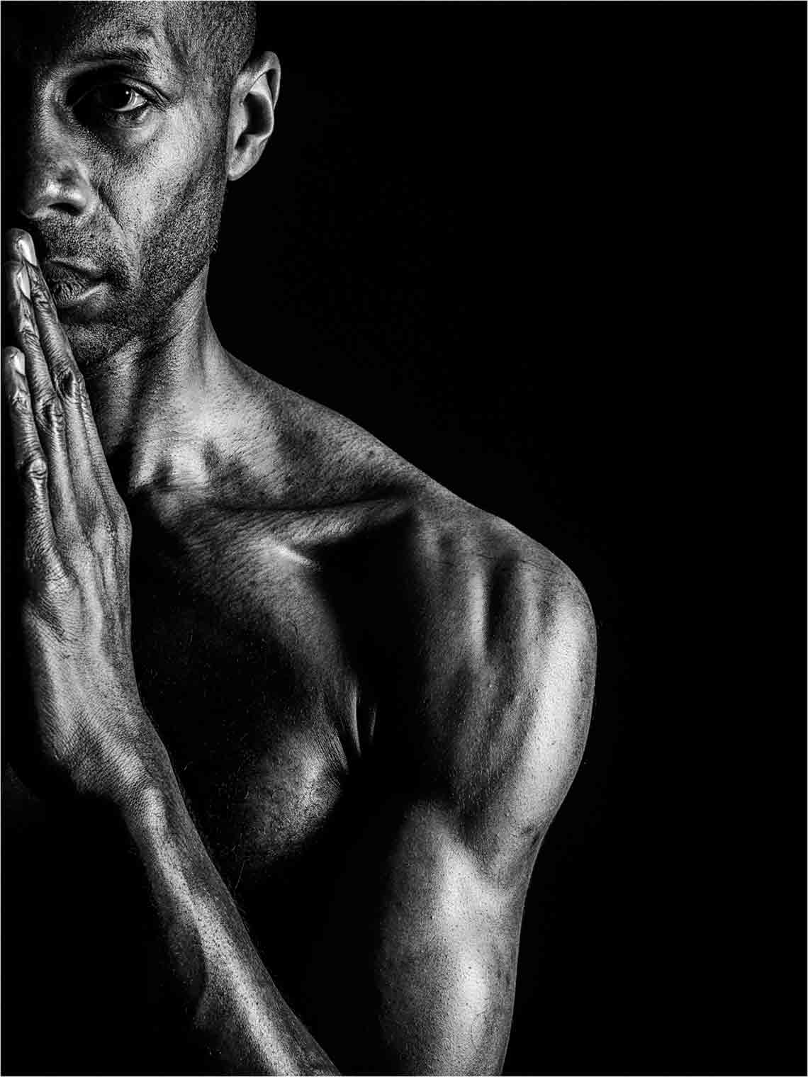 |
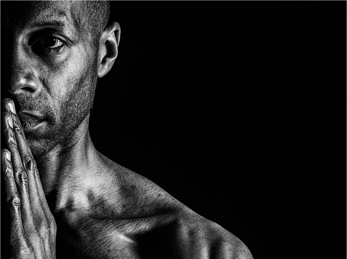
We all have to start somewhere and this is where Mike Started. He continues “this is one of my favourite individual portraits and I wanted to explore if it would be possible to build a panel using this as a starting point. This naturally led to the answer of the first two questions: what genre of photos – Portraits, and whether it was going to be Monochrome or Colour (whilst it theoretically isn’t impossible to mix the two, you are giving yourself a significant and un-necessary challenge or as Mike refers to them “Opportunities to Fail” – More on that later. Remember, the assessors want to pass your panel – every opportunity to fail that you present them with, reduces your chance of success. |
Reviewing existing works
The next step is to either shoot images specifically for the panel or to examine what images you already have. Whilst a number of people have been very successful with the former, that requires a degree of pre-visualisation that Mike freely admits that he lacks.
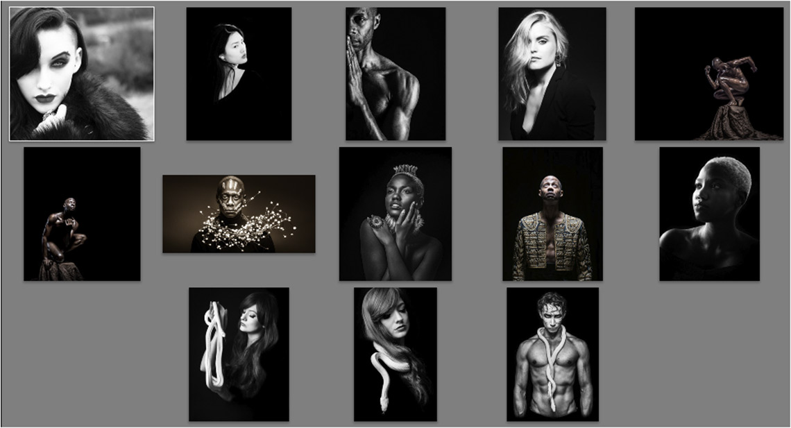
The search proved fruitful, Mike located the following.
Whilst not all monochrome, it’s easy to see the potential for contributing to a panel once converted.
Layout and media
Panels are more than just a collection of images; they have to fit together cohesively. How they work together is in part down to a decision regarding media. Whilst choosing projected image avoids the cost of printing and presentation, it makes the likelihood of success significantly harder.
For anyone of a more mature persuasion, think of the old AVs or slide sequences, where each image had to flow into the next. Projected sequences are no different; each image has to take you on a journey to the next.
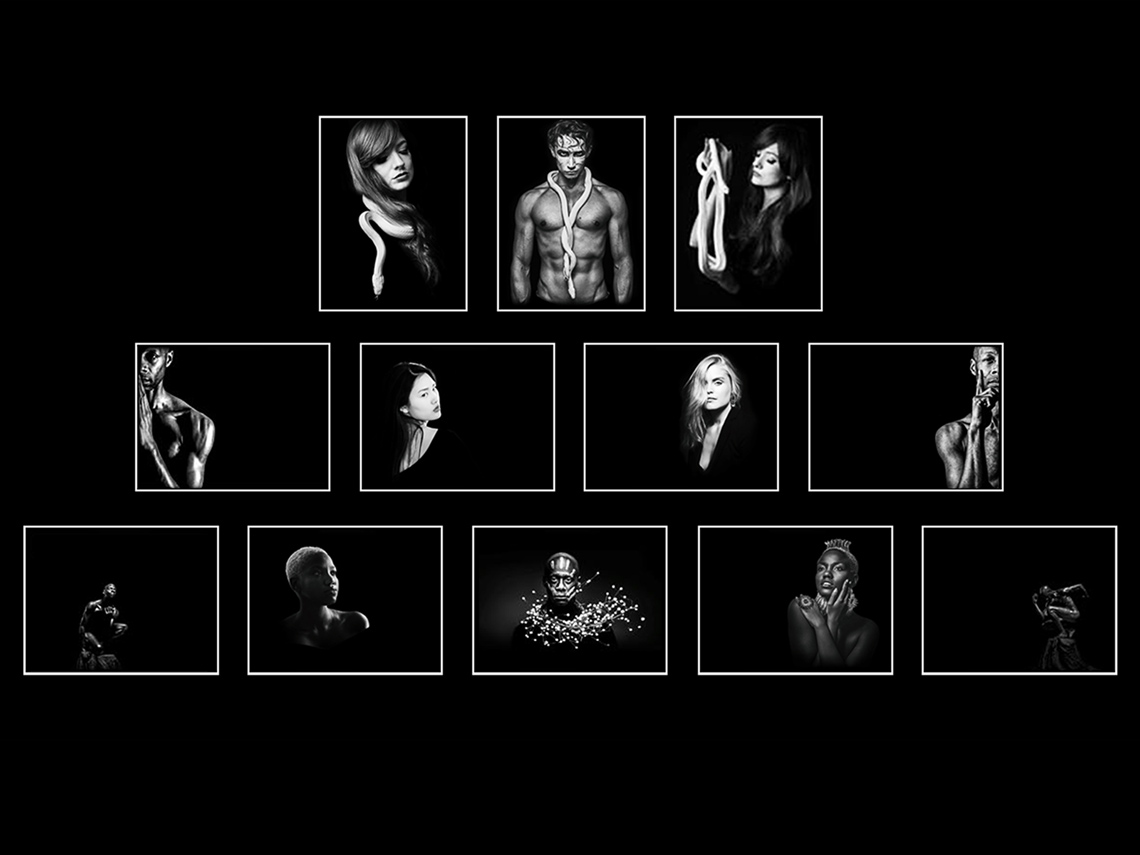
With prints, assessors can see all the images together and therefore assess the cohesiveness and relationships more easily. If assessors find it easier to understand the layout then your chances of success increase. But panels come with their own challenges. For the Welsh Associateship you are required to submit a panel of 12 images distributed over 1, 2 or 3 rows. So the next step is to consider the layout.
The panel has to be ‘balanced’ which involves ‘pairing’ images to identify those than belong on the left, those to the right or centre images. You can see the result of this in Mike’s images below, pair joined, centre images identified (C) and odd ones out identified.
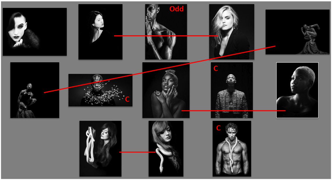
Some pairs are easier to spot than others – the two crouching figures. Less obvious are the two photos of the female model on the centre row; both are facing to the left. Given this is a portrait panel and she is probably un-known to the majority of viewers, Mike has no reservation about flipping one so that they face in opposite directions. Obviously for some genres this wouldn’t be possible, particularly those with text in frame or recognisable subjects.
Presenting the panel
Here’s where some of the most common “opportunities to fail” lurk in waiting for the un-wary.
Clearly there is a ‘missing’ image to the right of the middle row. But look at the others; the mix of portrait and landscape format, the different aspect ratios, the misalignment of images, the different size of the figure within the image are all are opportunities for the assessors to mark down your presentation, and the more of those you provide to the assessors, the greater the chance you will fail. One further opportunity to fail is regarding the overall arrangement of the images. If it is possible for the assessors to change the position of images within the panel to get a better or alternate arrangement, then, potentially they could consider that you have failed to assemble the images in the optimal or most aesthetic layout, which is another potential negative.
Mike went about eliminating all of these “opportunities to fail” by deciding to:
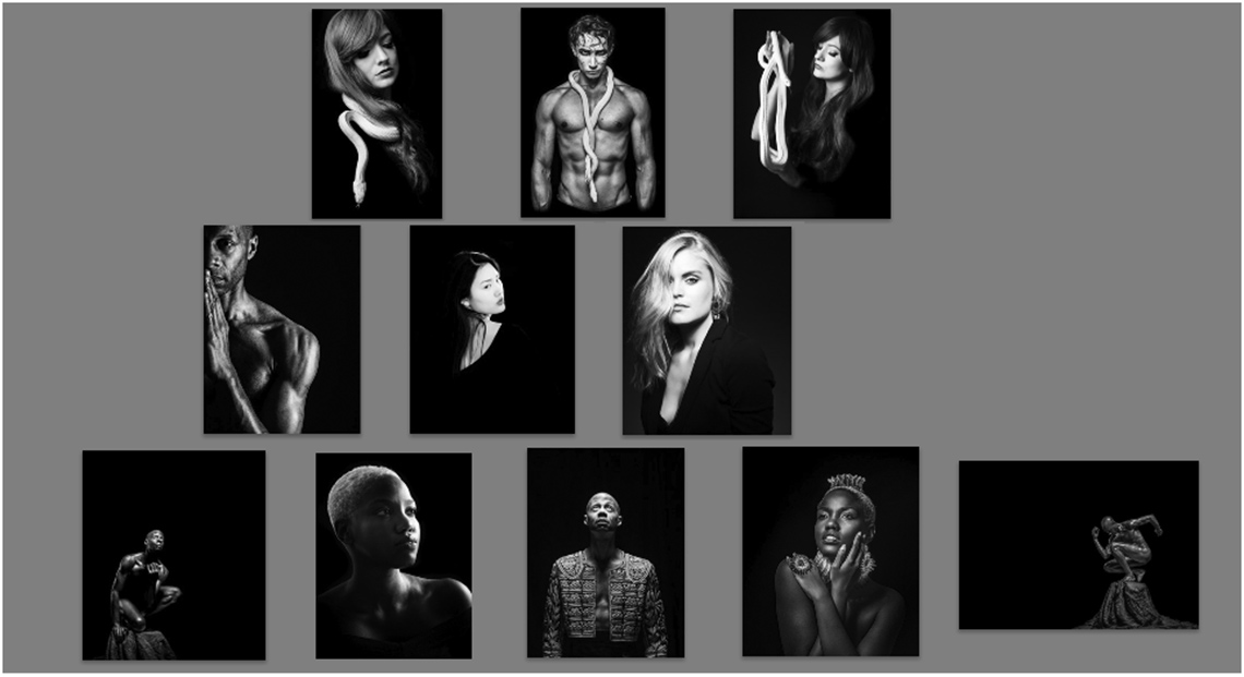
- Make all the images the same size; the top row in portrait format and the remainder in landscape orientation.
- Balance the figures by enlarging or shrinking figures to address the size difference
- Indicate where in the panel the image belongs by moving the subject to the left or the right of the frame.
Pushing a left facing figure to the right of the image, filling the left with negative space anchors that image to the right of the panel. If it cannot be swapped to the left, you have reduced the assessors’ ability to consider potential alternate layouts, and the fewer options for different arrangements they have the higher the chance they accept your presentation as being ‘correct’.
All of the above were accommodated by Mike’s decision to have the figures isolated within a solid black background, meaning size, position, within each image could be managed individually, as well as collectively, to provide the overall balance.
Finishing the Panel
Whilst there were a few additional challenges (Mike talks about these in his regular lectures to camera clubs) the biggest remaining challenge was going out and shooting another strong image to compete the middle row.
The final step is the printing. As a Fotospeed Ambassador this didn’t present any challenge. Whilst several of the original images were printed on Platinum Baryta 300 or Platinum Gloss Art Fibre 300 (both excellent papers), Mike chose to print all the images on PF Lustre 275 as this has a surface that is more resilient to handling which is inevitable when putting the panel up for assessment (not that he needed to be concerned on that front as the assistants on the day took tremendous care when handling everyone’s work. The choice of black mounts with a white core (providing a white key line) was really a no-brainer.
Below is Mike’s successful Associateship panel.