Introducing Matt Baryta 310 - Tony Worobiec
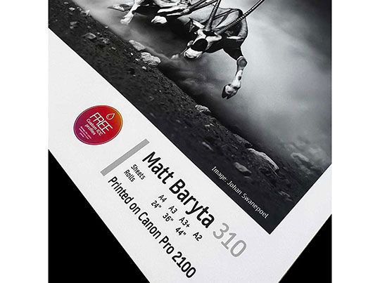


Matt Baryta 310
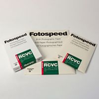
Mindful that I am a great fan of Platinum Matt 280, Fotospeed have very kindly sent me some samples of their latest Matt paper, Matt Baryta 310. Designed to satisfy the needs of both Photographers and Fine Artists, this paper certainly does match up to the hype.
Manufactured from 100% cotton this really is a high-quality paper. Not unlike the Platinum Matt, it boasts a Smooth Matt Fine Art surface which lends itself to those wishing to exhibit their work, or possibly seek a distinction either with The Royal Photographic Society or The PAGB. Unlike some high gloss papers, there is no risk of the paper appearing to buckle. The highlight and shadow detail one can capture with this paper is simply astonishing; the D-max is particularly impressive.
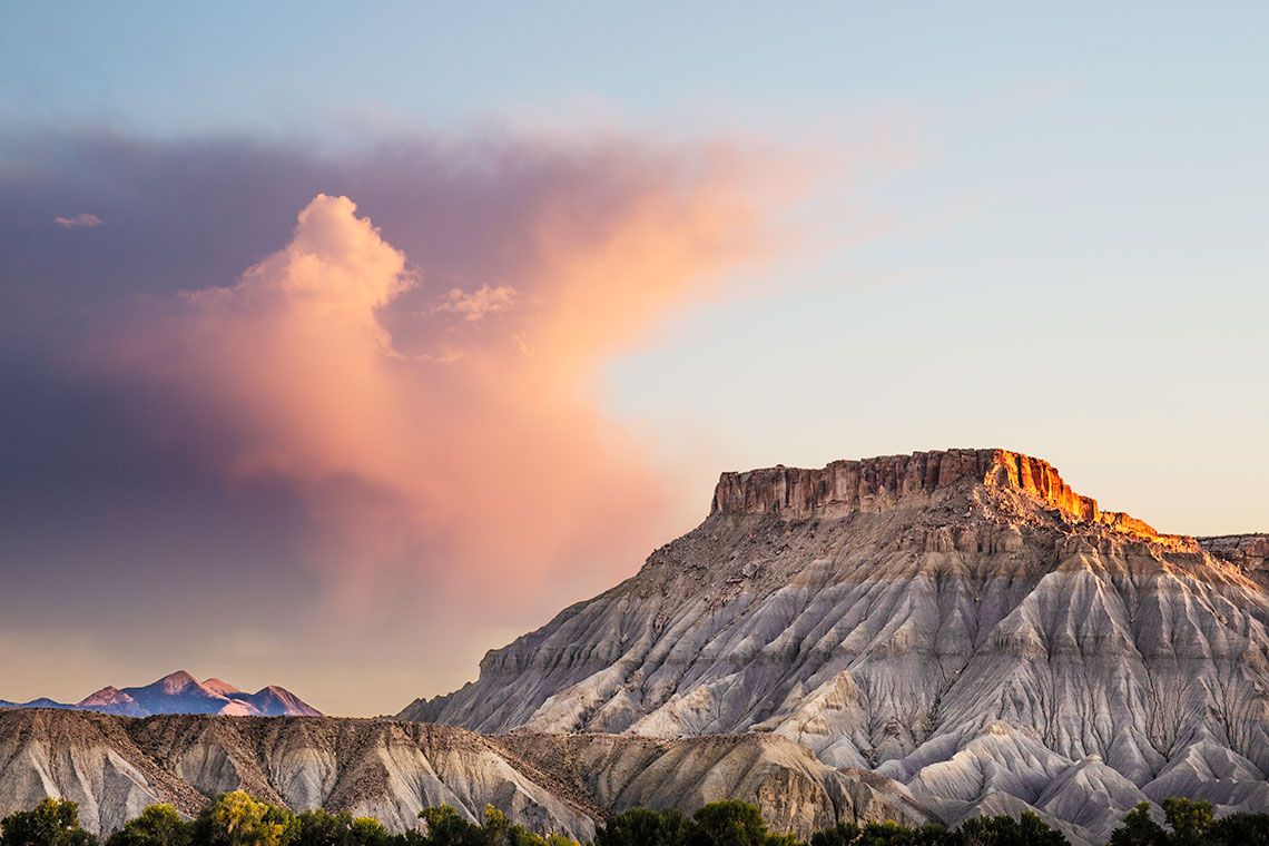

Illustration. Passing Storm.
It is often assumed that to capture this level of drama in a print, one needs to use a pearl or glossy paper, but Matt Baryta copes extremely with this wonderful range of colours. Moreover, its capacity to render subtle detail truly is remarkable.
Selecting the paper of course is a very personal decision dependent on one's own requirements. I regularly exhibit my work and sometimes I am fortunate to make a sale. Most clients will insist that the work is signed and what I especially enjoy about this paper is that it takes a signature in a soft 4D pencil, (Fine Artists take note) which certainly adds to the image. A small point perhaps, but it is a feature often appreciated by purchasers.
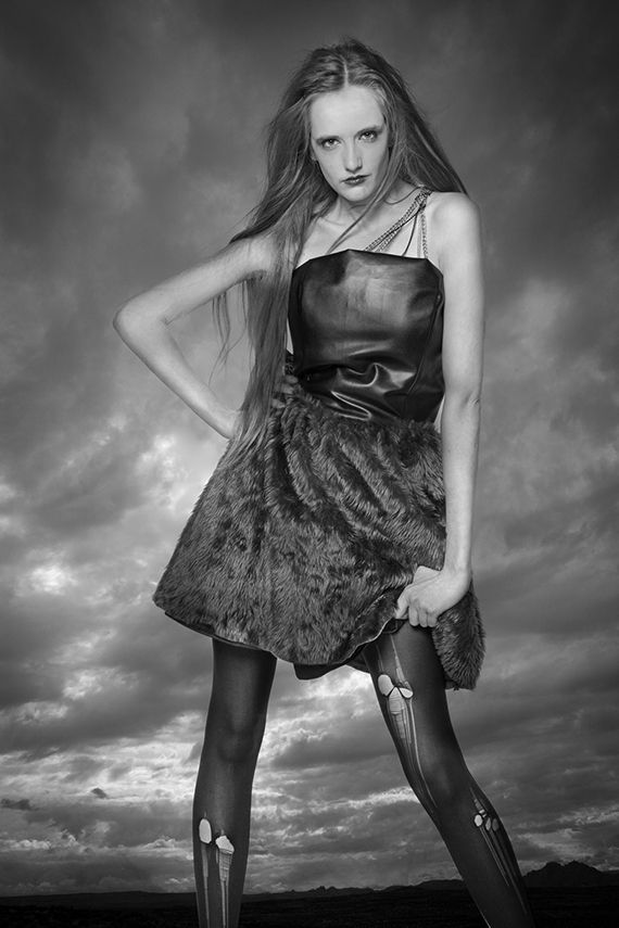

Illustration Model.
This is an image I regularly use to check out the capacity of a given paper to handle monochrome, and I can conclude I wasn't disappointed. Whilst this is quite a punchy image, I was particularly pleased with how it retained very subtle highlight detail in the face and arms of the model, whilst at the same time capturing the rich and punchy textures of the garment she is wearing.
Compared to Platinum Matt, the white base is a fraction creamier, however the acid test comes when printing in mono. As an ex-darkroom devotee, I can assure you that the results when printing in black and white are as impressive as the finest traditional silver prints, the highlights positively glow. This paper boasts a whiteness (CIE) of 85.
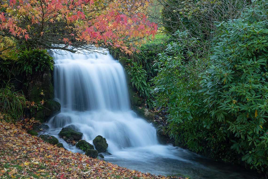

Illustration. "Waterfall"
Photographed just a couple of days ago, I was naturally curious to see how it would fare printed on this new paper and I have to say I wasn't disappointed. Once it goes into full production, I suspect this will become my paper of choice. It oozes quality, it has a reassuring feel and its capacity to yield even the most subtle detail is truly remarkable.
As you would expect of this type of paper it is acid and lignin-free, and so it is truly archival. Essentially you can sell your work in the confidence that it will last for decades, which is why Fotospeed have marketed this product both at Photographers and Fine Artists. It is a paper that can be confidently used on all commercial thermal and piezo water-based printing systems like Epson, Canon, Hewlett-Packard and Kodak.
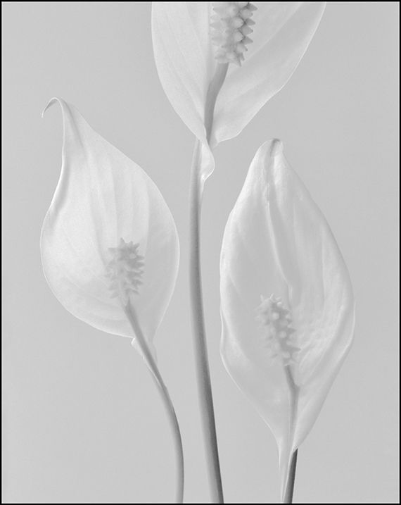
Illustration; Lilies.
High-key, this image also serves as an excellent test for any new paper, and I am delighted to report that Matt Baryta fared extremely well. Properly profiled one should be able to achieve a reassuringly neutral set of tones, which are wonderfully smooth and beautifully nuanced.
This paper is designed to be both pigment and dye ink compatible and as you might expect from a Fotospeed paper the colour gamut is truly exceptional. It does suggest that the ink dries almost instantaneously, but personally I would aim to leave a print to dry for at least a few hours, particularly if you are printing for exhibition.
