Currency
Thinking in Monochrome: Top Tips from Chris Palmer
21/Apr/2022

Chris Palmer is a photographer and Fotospeed ambassador. Here he talks through his process for black and white photography.
When colour photography became commercially accessible to photographers in the 1960s, there was a suggestion that black and white photography had had its day and that it would die out. However, despite the passage of time, it still holds a strong attraction for many.
There is a lot more to producing a successful monochrome image than simply taking out all the colour. The image needs to be appropriate to the medium, to benefit from it, and the way that it is converted is important too. So what’s the best way to get a captivating black and white image?

What sort of images work effectively in black and white?
Strong graphic shapes, lines and textures, often found in Brutalist architecture, make excellent black and white photos. Black and white simplifies an image, because the viewer is no longer influenced or affected by the colour. As a result, these graphic shapes become even more prevalent in a monochrome image.
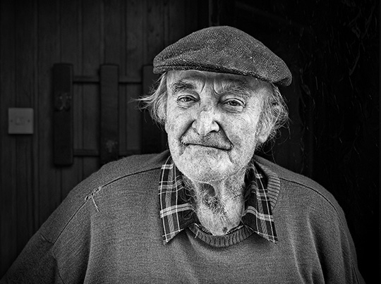
There are also occasions where colour actually detracts and distracts from the contents of an image. For example, an urban portrait with colourful backgrounds, or when a characterful old man is wearing a colourful shirt. In monochrome they just become tones of grey that places a much greater importance on the subject. Documentary and reportage photography often benefits from the monochrome approach. Essentially it takes the viewer one step back from reality, they cease to be influenced by the reality of colour and can more effectively engage with the content.

How to convert an image to black and white
There are a multitude of different ways of converting a colour image to monochrome, be it through Photoshop’s black and white mode, or through an external plugin like SilverFX.
Whichever you choose you will normally have a good opportunity to influence and control how each individual colour is rendered as a tone of grey. This tonal separation can be utilised to isolate or separate out a particular element, or strengthen the importance of an area within the image, for instance, to isolate a tree, or to improve the rendition of a sky.

Printing black and white images
When it comes to printing it is important to use a good quality photo printer that possesses not only a black ink, but intermediate grey's too. This provides a more pleasing tonality and a smoother graduation.
Two printers that do this are the Epson P700 and the Canon Pro-300 A3+ printers. Both will produce perfect black and white prints. Either through the black and white modes of each printer or via Fotospeed’s free custom profiling service. It can often be a challenge to produce a truly neutral monochrome print that doesn't possess a slight hint of a colour tone. The path to success is to either use a custom paper profile specific to your printer, rather than a generic one, or to use the black and white printing modes that most printer manufacturers provide.
Lastly, paper choice can also have a big effect on the final result, but all of the Fotospeed papers are capable of good results once you've mastered the technique. If you need a little more guidance, take a look at Fotospeed’s blog on the best papers for black and white prints.
Chris Palmer is a photographer and Fotospeed ambassador. You can view more of his work here.
You can watch Fotospeed’s Tim testing out papers for black and white printing on the Fotospeed Youtube channel. For more tips and tricks, sign up to our newsletter.